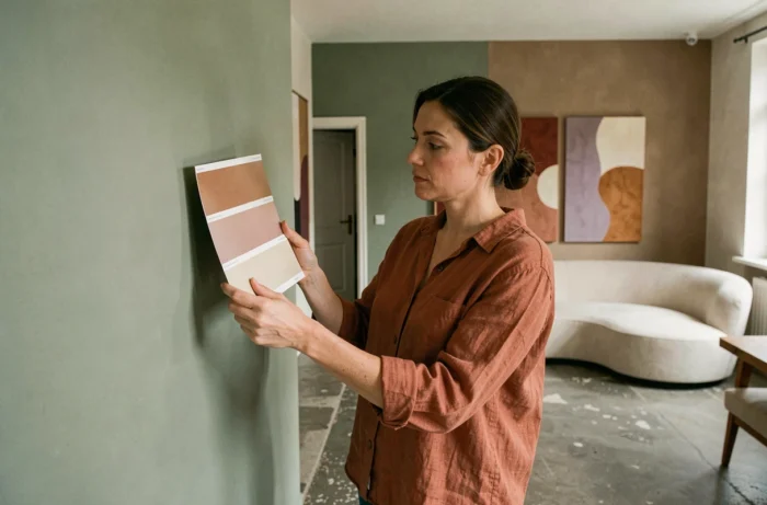
The decline of cool grays and optical whites is no longer a colorist’s hypothesis; it is a market fact. The 2025 color charts from major paint brands converge towards enveloping neutrals, saturated hues known as “jewel” tones, and a butter yellow that is establishing itself as a standalone reference. Here, we decode the palettes that are truly structuring decor projects this year, beyond seasonal announcements.
Butter Yellow and Saturated Tones: The Two Chromatic Axes of 2025
Butter yellow is not to be confused with a classic pastel yellow. Its warm, slightly creamy dominance positions it between sand and light ochre. In decoration, it functions as a luminous neutral, capable of replacing off-white on large surfaces without causing visual fatigue.
We observe it as a flat color on bedroom or living room walls, paired with tone-on-tone woodwork. Butter yellow replaces off-white as a luminous neutral background in many residential projects. Its appearance changes little between natural light and warm artificial lighting, simplifying palette work.
The other strong movement concerns “jewel” tones: richer, more saturated colors identified by designers as early as spring 2025. These are not bright colors in the advertising sense, but deep shades (sapphire blue, dark emerald green, burgundy) that bring visual density to spaces. Here we find the trending colors of 2025 that mark a clear break from the previous minimalist decade.
Warm Neutrals vs. Cool Grays: A Fundamental Shift in Interior Decoration
Anthracite gray and pure white are not disappearing from color charts, but their role is changing. Gray is shifting from a dominant flat color to a punctuated accent, confined to woodwork, baseboards, or architectural elements. The same shift is observed for black, now reserved for graphic details.
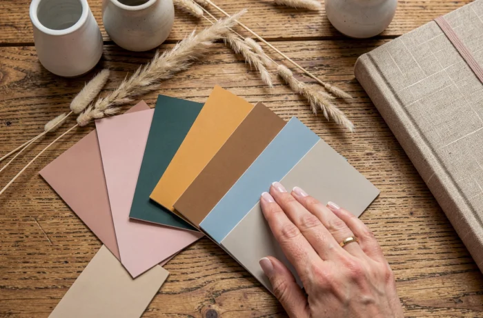
The rising neutrals are all warmer: taupe, greige, ivory, linen. Valspar’s research confirms this trend towards enveloping tones. In practice, this alters the way we build a palette piece by piece.
Creating a Warm Neutral Palette for a Living Room or Bedroom
- Choose a main background in the ivory-linen range, checking its undertone (pink, golden, or greenish) under the actual light of the room
- Introduce a depth accent with a strong taupe or chocolate brown on a wall, alcove, or door frame
- Reserve cool tones (light gray, glacier blue) for removable textiles, cushions, or curtains, to adjust seasonal balance without repainting
- Systematically test samples in warm artificial light (2,700 K), as warm neutrals can easily shift to a dirty yellow under poor lighting
This approach avoids the trap of “all beige” that some projects reproduce for convenience. The nuance between a greige with a pink undertone and a linen with a golden undertone radically transforms the atmosphere of a space.
Colors and Emotional Comfort: A Technical Choice Criterion, Not Marketing
Several palette analysts describe a shift towards colors designed for emotional stability and reduced visual fatigue. This is not a vague argument: medium-saturation and controlled-brightness shades reduce eye strain in prolonged living spaces (home office, bedroom, living room).
In kitchens, where light is often harsher, soft greens and moderate terracotta are replacing glossy whites. Green, in all its shades, remains the most requested color in interior decoration, but its variations are evolving. We are moving away from the ubiquitous sage green towards lighter, almost aquatic greens, or conversely, very deep forest greens.
Adapting Color Choices to the Function of the Room
A north-facing living room does not react like a south-facing bedroom. We recommend treating each room as an independent project rather than rolling out a uniform palette throughout the home.
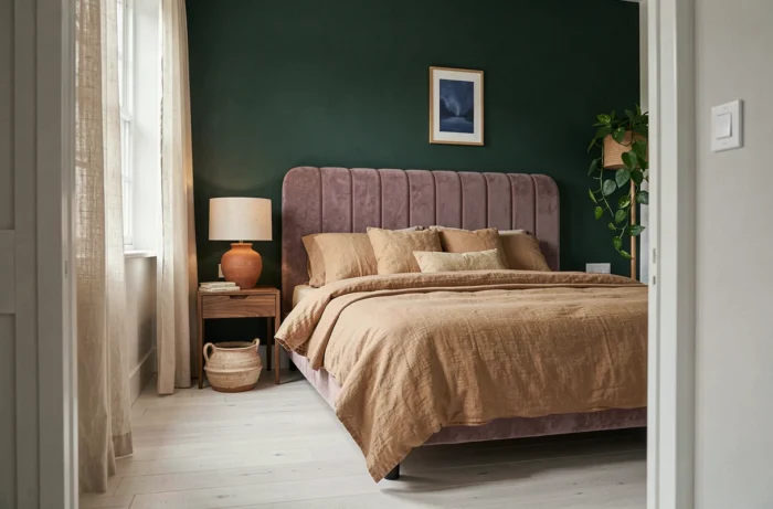
In a bedroom, shades with a strong blue or green component promote calm. In a workspace, an accent wall in a saturated color (deep blue, burgundy) can structure concentration without overwhelming the volume, provided the flat color is limited to a small surface.
Color Trends 2025 in Homes: What is Changing in Decor Palettes
The 2025 palette is built on two complementary registers: a base of enveloping warm neutrals and accents of dense, almost jewel-like colors. This duality replaces the previous scheme where a single cool neutral served as a backdrop for an isolated “pop” color.
Interior design also incorporates a functional and emotional dimension in color choices. Earth tones (terracotta, clay, burnt ochre) remain present but lose their monopoly in favor of more sophisticated shades. Mauve and apricot tones, for example, bring a different warmth, less rustic, more urban.
- Butter yellow as a bright alternative to classic off-whites
- Jewel tones (sapphire, emerald, burgundy) as depth accents on furniture or a single wall
- Warm neutrals (greige, linen, ivory) systematically replacing cool grays
- Green in a lighter or very dark version, never in an intermediate sage-type shade
Black and gray become accentuation tools, not backgrounds. This repositioning alters the visual hierarchy of spaces and requires rethinking finish associations (matte, satin, glossy) based on the warmth of the chosen palette.
The most accomplished projects we observe this year share a common point: they limit the palette to a maximum of three or four references per room, playing on variations in brightness rather than multiplying shades. Chromatic sobriety has never meant the absence of color, but the mastery of its distribution in space.